Brand sheet
The look the website draft is built from. It comes from the card and emblem concepts you liked best: dark ink outlines, flat colour, fieldstone, water, a low sun, and the trees people plant here.
The mark

Main emblem
On forest green
 ZenScapesHardscaping and landscaping
With the name


Simple icon for small sizes
Colours
Paper#FDF4DF
Page backgroundInk#1E0F05
Text and outlinesForest#0A2E0A
Deep bandsSun#F5B526
Buttons and accentsFieldstone#DDAB68
Stone fillsRed clay#C95523
Soil and rust stoneWater#2E8BCB
Water and focus ringsMaple#D32A1D
Sparing highlights
Type
Stone set right.
Source Serif 4, for the name and headings. It matches the lettering on the cards.
I find where the water comes from, then give it a proper way out.
IBM Plex Sans, for everything else. Set large and dark so it reads easily.
Illustration set
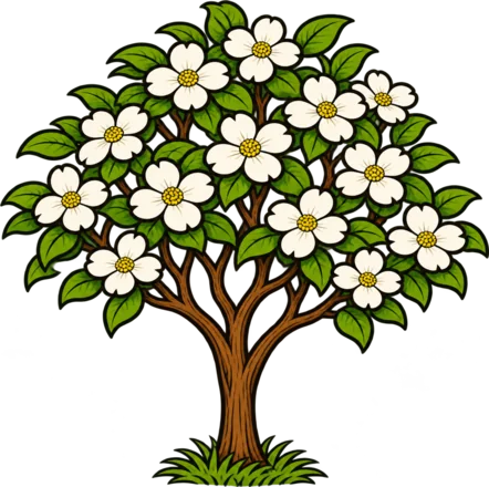
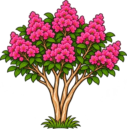
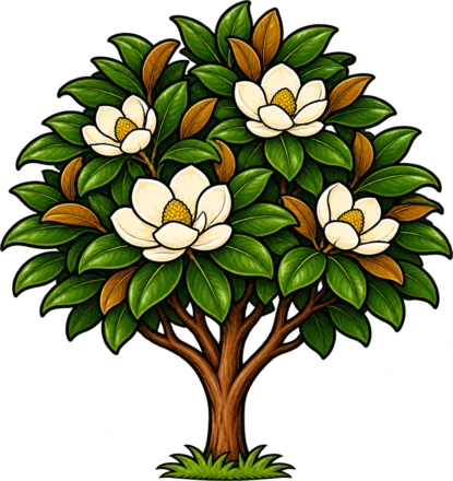
Drawn for the website in the same hand as the cards. The illustrations set the mood; his own job photos stay as the proof of work.
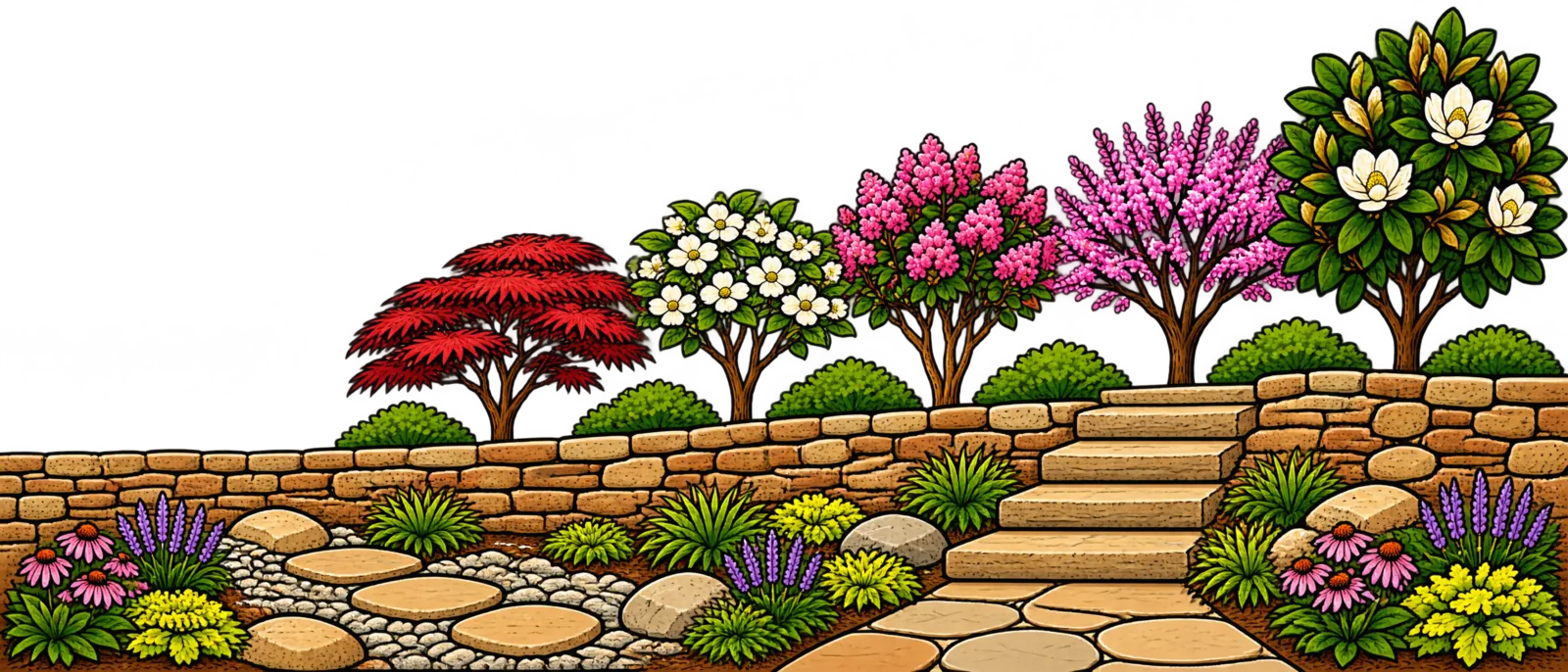
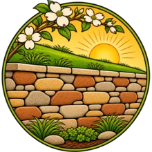


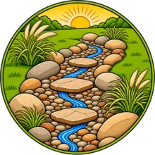


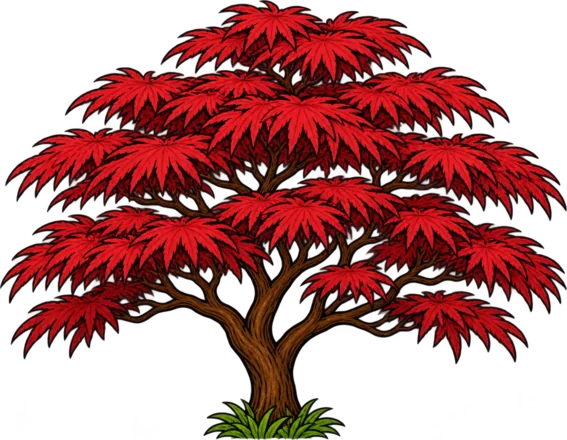


How it is used
- Illustration for the brand, photographs for the proof. Every picture of finished work is a real photo of his own jobs.
- Drawn like the art. Buttons, frames and diagrams use the same dark outline and flat colour as the illustrations.
- Stone divides the page. A course of fieldstone runs between sections, as it does along the bottom of the cards.
- Plain words, first person. He speaks for himself, and says what he builds and how.
- Large, dark text on a light page. Easy to read on a phone in daylight.